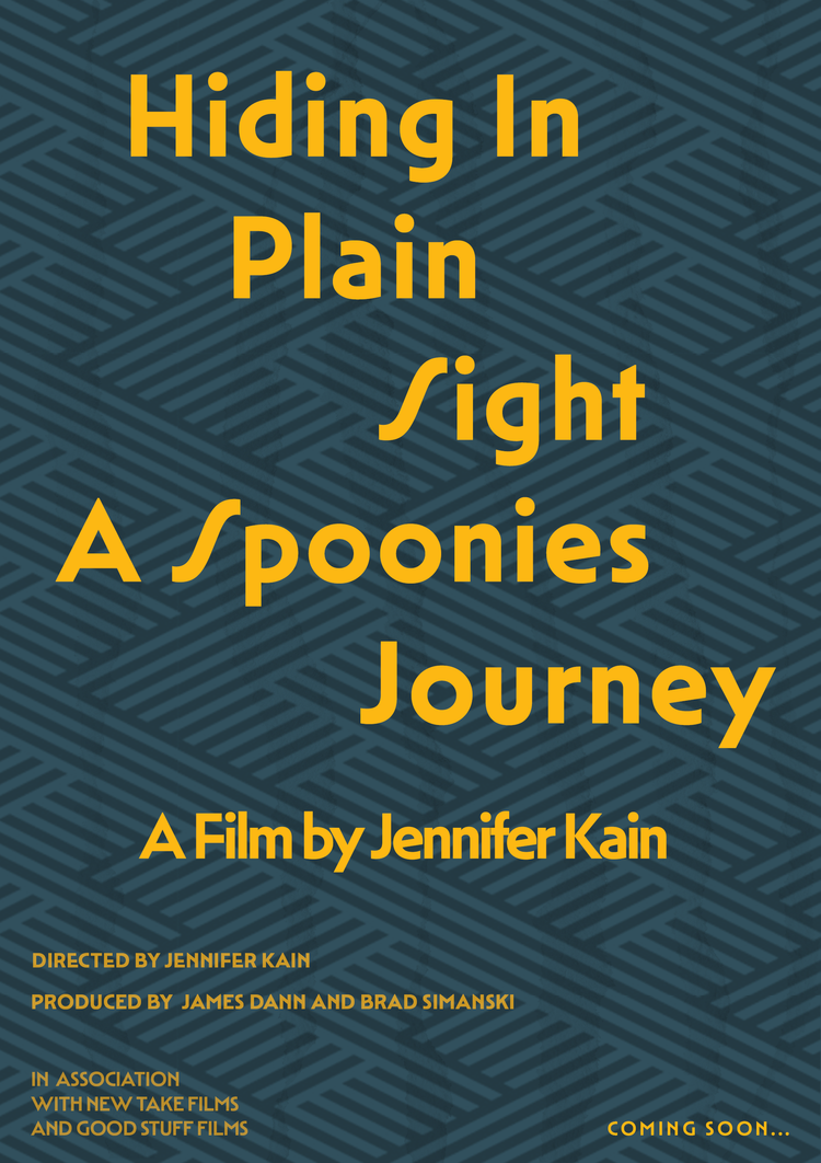
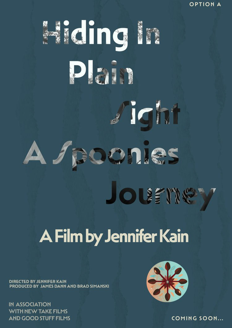
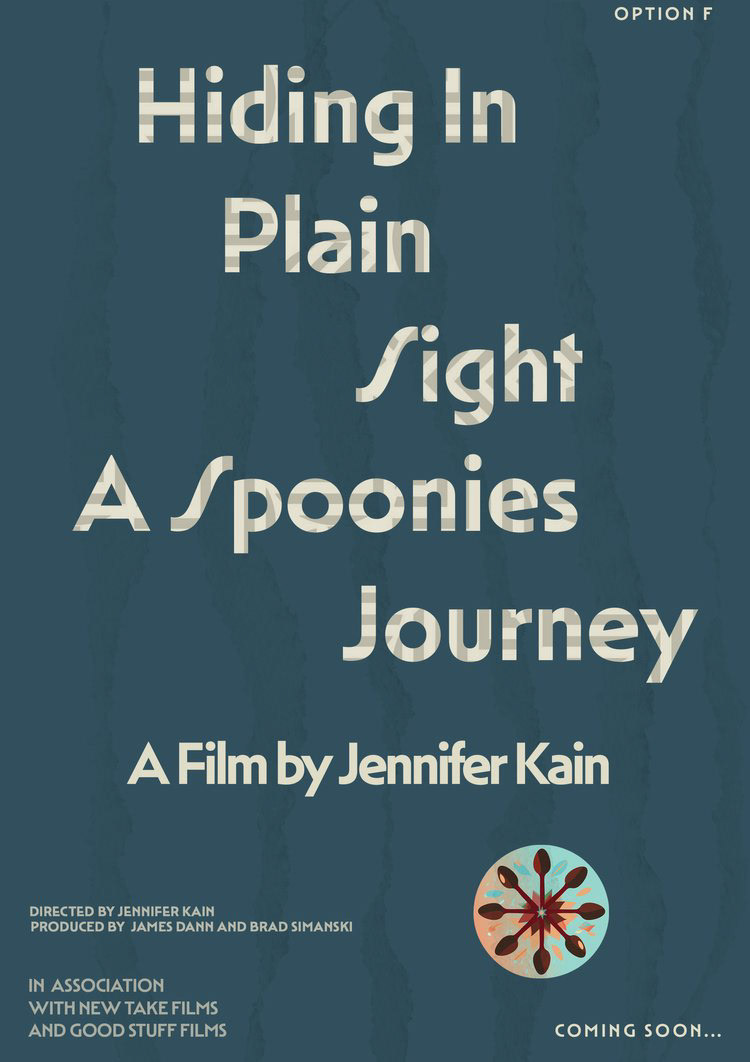
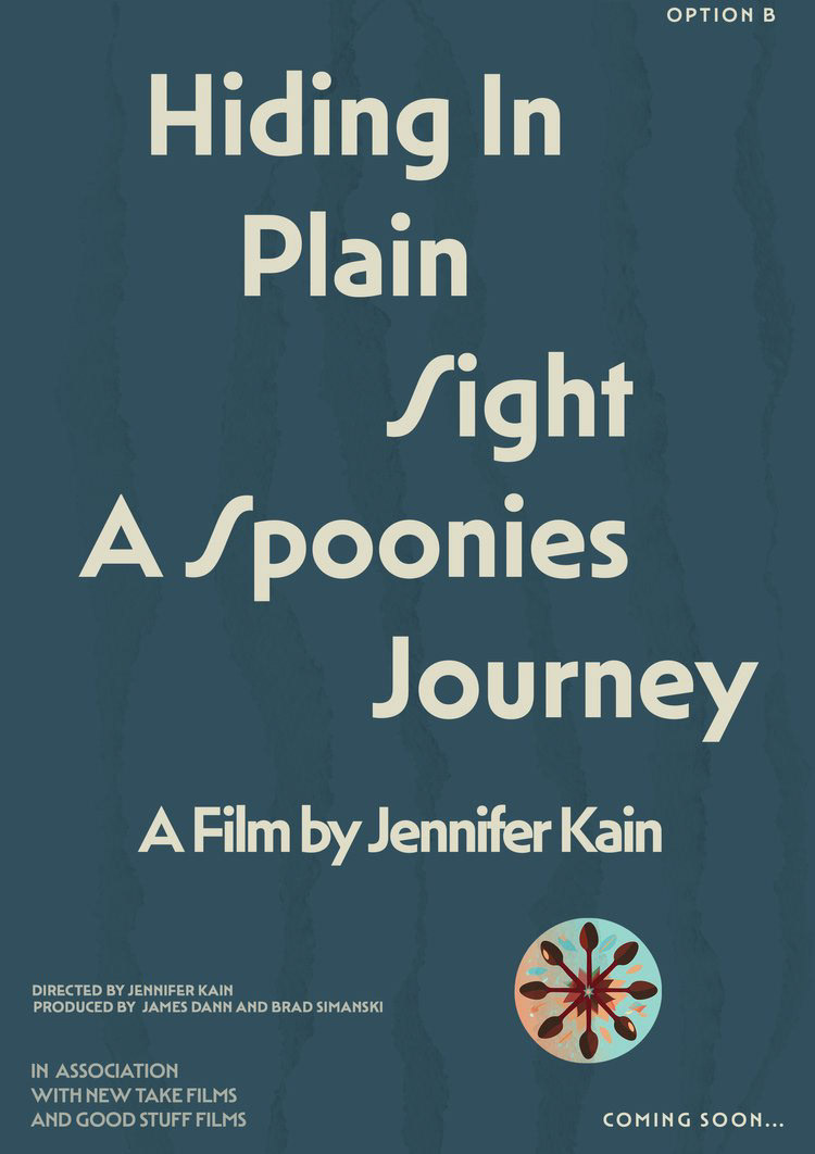
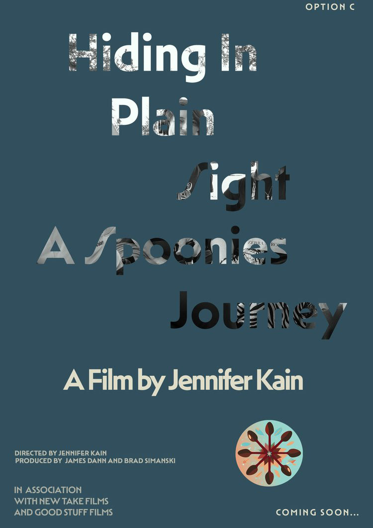
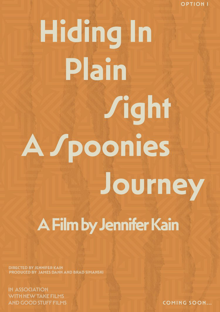
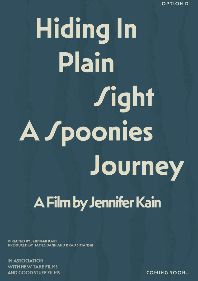
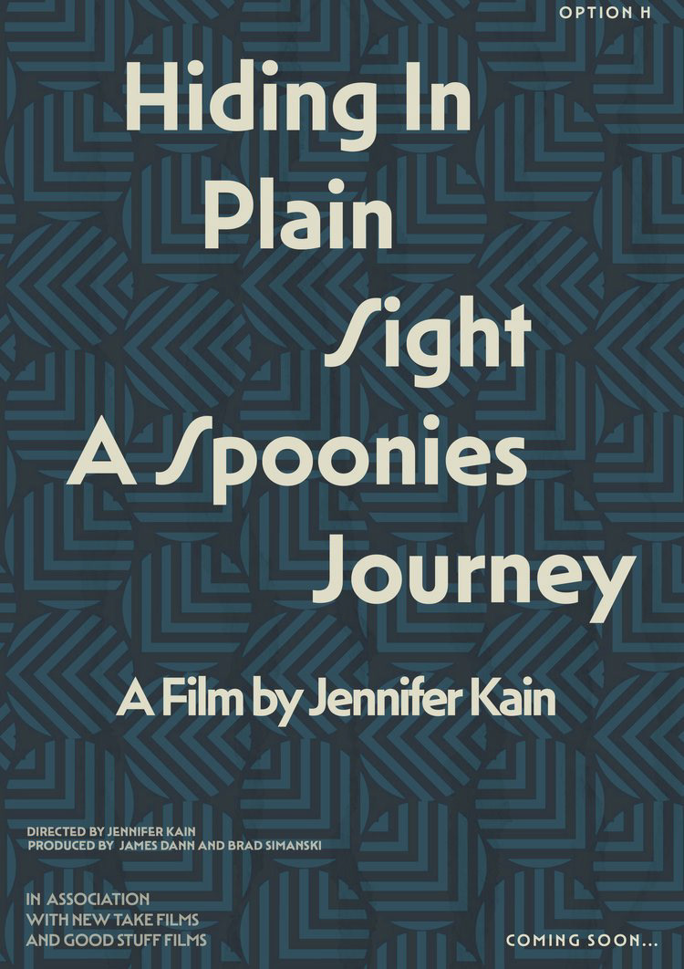
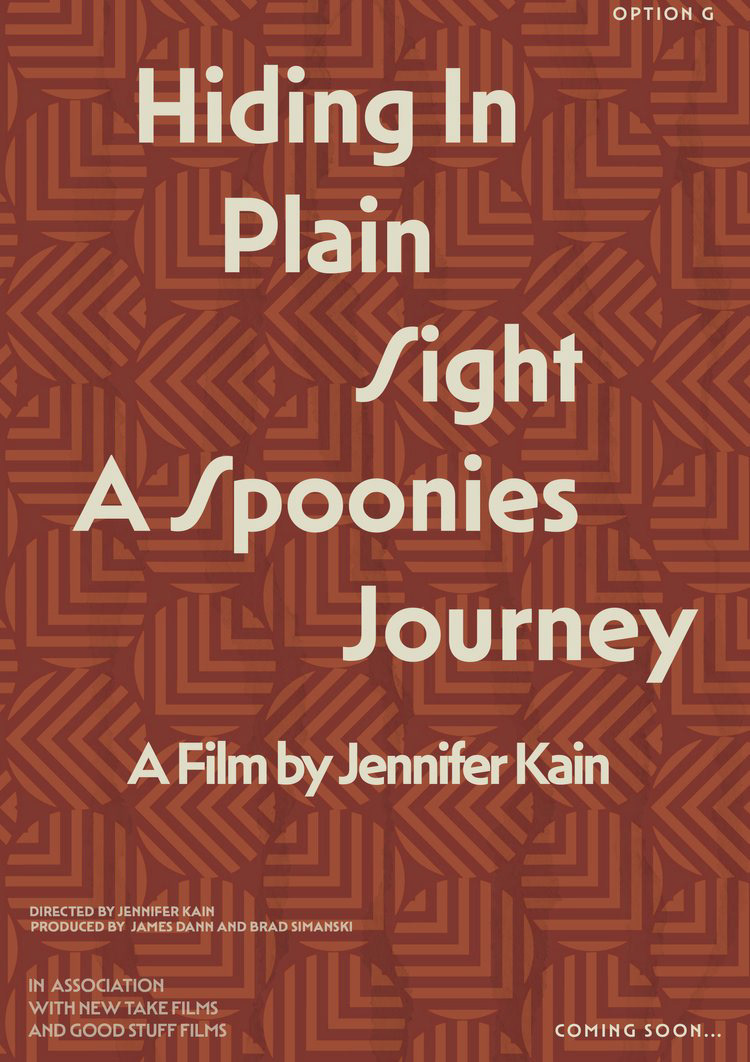
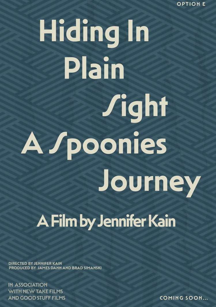
Case Study 1
When deciding what kind of film poster to do there were various looks and feels for it. We used data to figure out what the poster should look like. The blue and yellow poster was the final choice but a poll was done to decide which user friendly design worked best.
Ultimately this poster wasn't used as the final version for the documentary and the title changed as well. You can learn more about the final film and movie poster under the Exhausted Existence link.